
Updated October 2026
Andrada Damian, also presented as Andrada Damianovskaia, brings photography and painting into the same image. This Photographer of the Week feature first appeared in August 2015. Its twelve images range from restrained black-and-white studies to photographs surrounded by blue, violet, rust, and pale painted textures. The update keeps that original gallery and studies the visible decisions that make it work.
This is a historical portfolio feature, not a new interview, a darkroom tutorial, or a claim about her current practice. The original artist statement described black-and-white argentic photographs worked with pigments. In this context, argentic refers to traditional silver-based photography. The statement emphasized her interest in mystery, metaphor, and the meeting of a photographic image with a painterly surface.
I am interested in what those choices do to a picture. A face can remain recognizable while the surrounding surface becomes uncertain. A hand can become the main subject without showing an entire person. A photograph can suggest a story without illustrating every event. Those are useful ideas to study, provided we keep observation separate from a guessed explanation of the artist’s intention.
A historical practice, described with care
The 2015 statement described those works as made without digital technology. That should remain an attributed statement about the featured work, not a blanket claim about every image she has ever made. In an older interview published by Ioana Filipas, Damian discussed scanning negatives and some prints, sometimes adjusting contrast or brightness, and allowing more substantial digital changes when she felt an image needed them.
The two accounts do not justify inventing a single production recipe for this gallery. They come from different sources and contexts. The honest description is that traditional black-and-white photography and painterly intervention are documented parts of her work, while the exact process of each individual image shown here is not supplied.
A 2014 exhibition listing for Visul lui Iacob described twenty photographic poems combining classical laboratory black-and-white photography with painting techniques. A September 2014 ARADON report also described photography with painterly interventions in an exhibition shared with Angela Hanc. These records support the historical relationship between the media. They do not establish current studio methods or a current exhibition schedule.
The Samaritan: a hand as the center of a picture
 Save
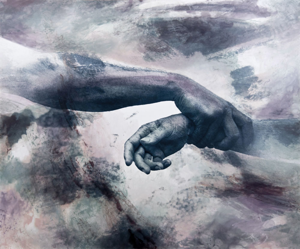
SaveThe hand is the clearest shape in The Samaritan. Much of the surrounding image is softer and less definite, so the arm gives the viewer something solid to follow. The curled fingers hold attention without needing a face. Notice how the direction of the forearm creates a route across the picture rather than placing all its weight in one small point.
The title can invite a religious or narrative reading, but it does not identify the model, establish a real event, or explain every mark on the surface. Start with what you can see: the angle of the arm, the contrast around the hand, and the difference between the defined body and the uncertain background.
For your own composition practice, photograph an ordinary gesture with a willing adult participant. Make the purpose clear, agree on how the image may be used, and keep the situation comfortable. Explore the frame through a small change in viewpoint or the amount of surrounding space. You do not need a dramatic prop to see how a hand can organize a picture.
Sacrifice: contrast, cropping, and an unresolved story
 Save
Save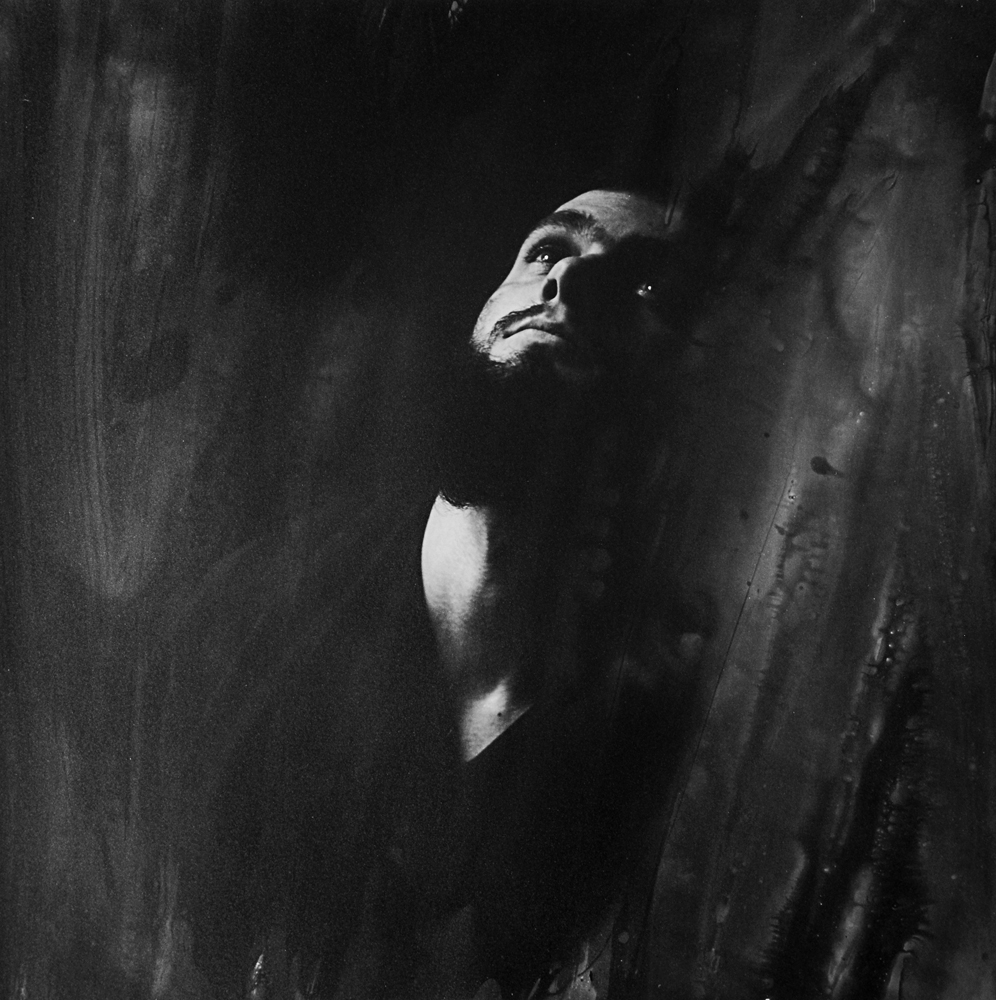 Save
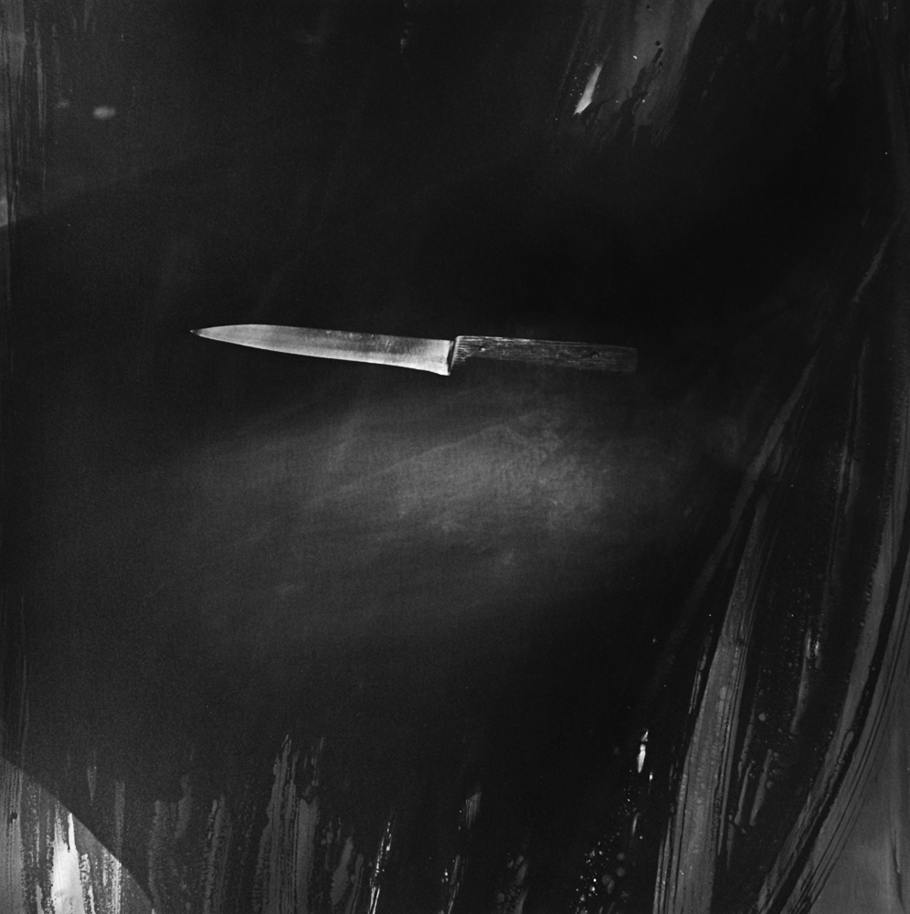
SaveThe first Sacrifice image isolates a blade-shaped object in darkness. The second gives the light to a head and upper body. Read them as two different distributions of brightness. One is narrow and horizontal; the other rises vertically through a human figure. Their contrast creates tension without providing a complete sequence of events.
The archive titles do not prove that an injury, restraint, ritual, or other real event occurred. These are presented as artworks, not documentary evidence about the people pictured. The gallery is not a set of instructions for reproducing dangerous scenes. If you study its visual tension, keep the exercise at the level of shape, light, and spacing.
A crop changes what a viewer is asked to imagine. Leaving part of an object outside the frame can make its role uncertain. That can be effective in an artwork, but it also means a caption should be precise about what is actually known. Do not turn visual ambiguity into a factual claim about a subject’s life.
The Gate: body, architecture, and blue
 Save
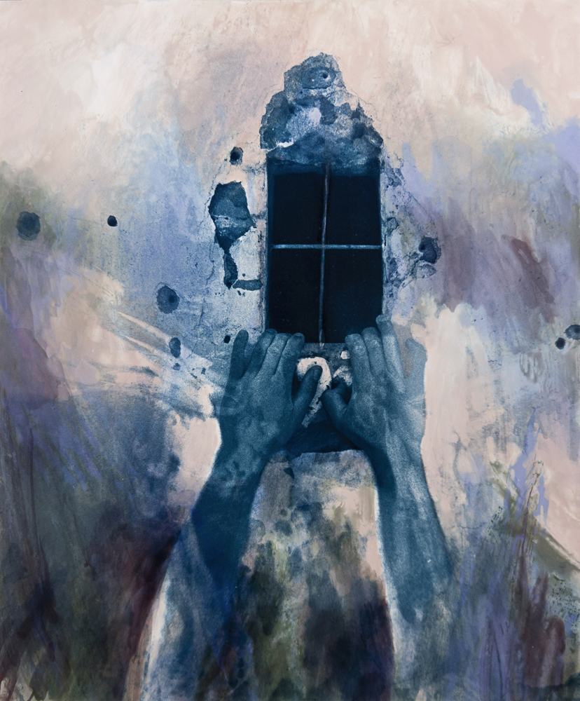
SaveThe Gate combines a small dark window with two raised hands and a much larger pale surface. The gesture connects the lower picture to the opening, while cool blue holds the parts together. The surrounding texture gives the window room to stand out. The picture joins the human gesture to the building surface without showing a complete figure.
Compare the weight of the rectangle with the figure. A small dark shape can dominate a much larger light area when its edges are clear. The hand position adds direction, which gives the eye a reason to move between the two. Those relationships remain visible whether you read the image through its title or simply as an arrangement.
In your own work, look for a clear relationship between a person and a doorway, window, or other simple geometric shape. Get permission for the setting and the portrait, and make the composition before adding any surface treatment. A texture will not fix a figure that has no clear place in the frame.
Sacrifice: the shoulder and the hands
 Save
Save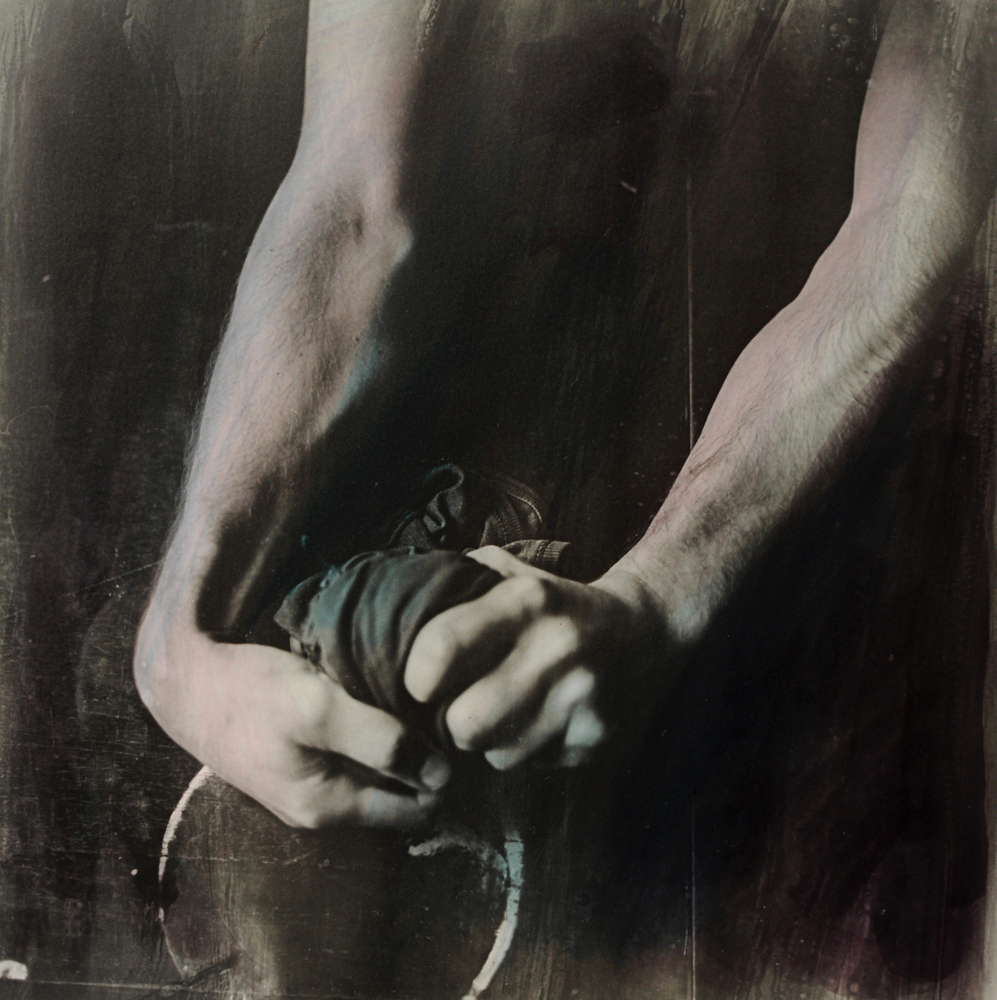 Save
SaveThese two images shift attention away from a full portrait. In one, the shoulder and hand create a compact arrangement; in the other, the forearms direct the eye toward the hands. The dark surroundings reduce competing detail. The body becomes a set of curves, angles, and bright surfaces as well as a human presence.
Do not assign an identity, a state of mind, or a real history to the figures from the pose alone. The visible rope-like element is part of the artwork, but the archive gives no account of how the scene was arranged. This discussion does not offer restraint techniques or advice for handling sharp objects. You can study converging lines with safe still-life objects or ordinary gestures instead.
A useful comparison is to cover part of a picture temporarily while you study it. Does the gesture still read? Is the brightest area also the most important one? This kind of viewing helps you notice what is doing the work, without claiming to know an undocumented lighting setup.
Jacob’s Dream: the surrounding surface changes the portrait
 Save
Save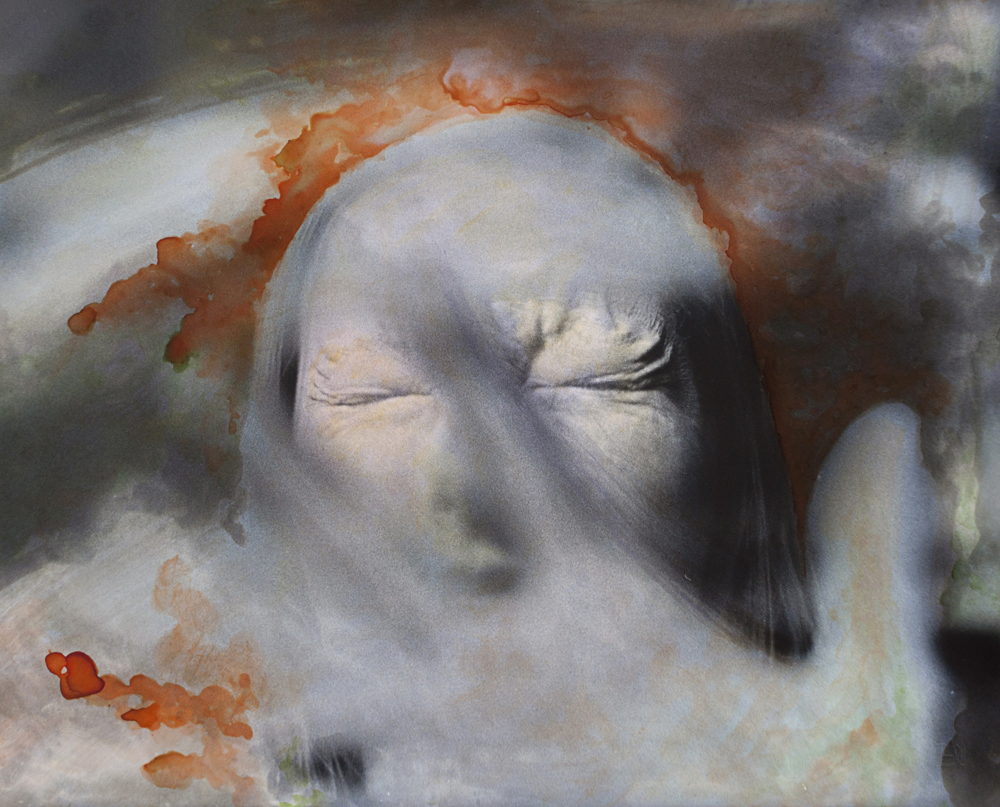 Save
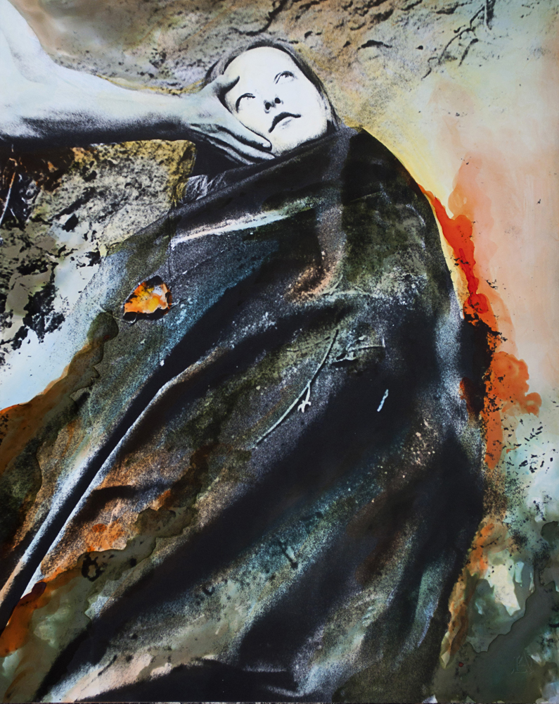
SaveThe first Jacob’s Dream image has a more contained figure, while the second brings the face much closer. Their surfaces are not neutral backgrounds. Dark blue-green fabric and warm orange marks establish one atmosphere; orange and pale gray establish another. The recognizable face remains important, but its relationship with the surrounding marks changes how the portrait feels.
Look at where the strongest color sits. Does it surround the head, pull toward a corner, or cross a boundary between the figure and its setting? A painterly intervention can add movement that the original pose does not contain. It can also distract from a face if every area becomes equally active.
The visible files do not identify the pigments, paper, tools, drying process, or order of operations. Those details cannot be recovered confidently from a web reproduction. This feature is about reading the finished work, not guessing a materials recipe or promising that an unknown treatment will be safe for your print.
Wise Man: a bird above the portrait
 Save
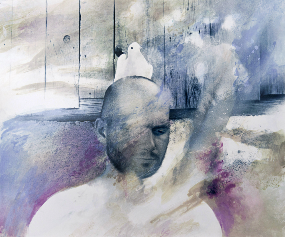
SaveWise Man places a pale bird above the portrait, with the bird’s head facing one direction and the person’s gaze facing another. That changes how you look at the head and its surrounding space. The pale surface and cooler marks connect the two subjects without filling the picture with many unrelated objects. The pairing is visible; its intended symbolic meaning remains open.
Compare the two directions as a viewing exercise. The person’s gaze points down and across while the bird looks away above the head. That helps you separate the arrangement of bright and dark areas from the familiar recognition of a face. Ask whether the pairing still has a convincing structure after the initial surprise fades.
Jacob’s Dream: a figure given more space
 Save
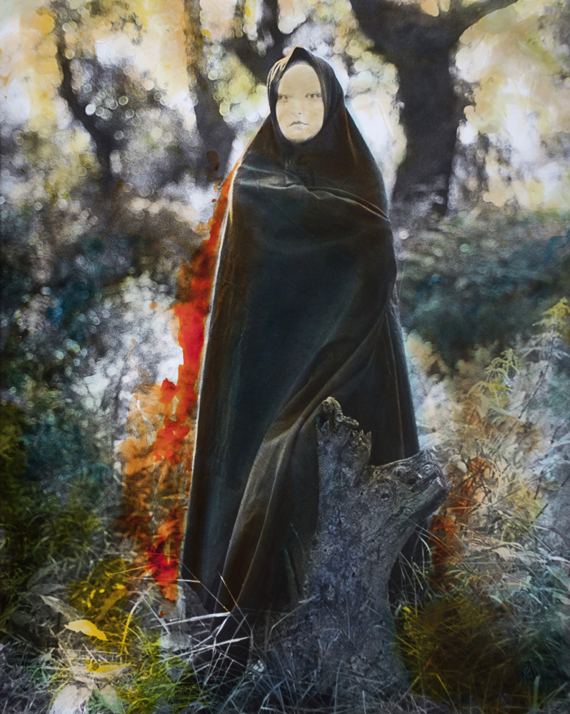
SaveThis image gives the figure more surrounding space than the close face study. The smaller head and long dark form let the environment contribute more to the picture. Compare the balance: a close portrait concentrates attention on features, while a more distant figure asks the surface, setting, and silhouette to share that attention.
The transition between dark clothing and the mottled surroundings is worth studying. Some edges remain distinct while others soften into nearby tones. Not every edge has to be equally crisp. What matters is whether the viewer can find the subject and then explore the rest of the image without losing the main relationship.
Crossroads: a break from the human figure
 Save
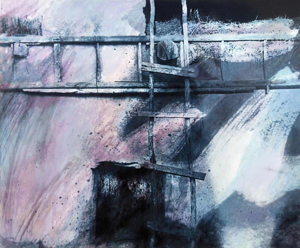
SaveCrossroads replaces the face and body with intersecting structural shapes. The harder lines offer a useful contrast with the surrounding textures. In the sequence, it gives the viewer a different visual task: follow directions and divisions rather than interpret a gesture or expression.
A portfolio can benefit from that kind of change. Repeating a mood does not require repeating the same subject in every frame. An architectural form can connect to a portrait through color, contrast, or rhythm. The connection becomes stronger when you can identify the visible relationship instead of relying only on matching titles.
Jacob’s Dream: the direct gaze
 Save
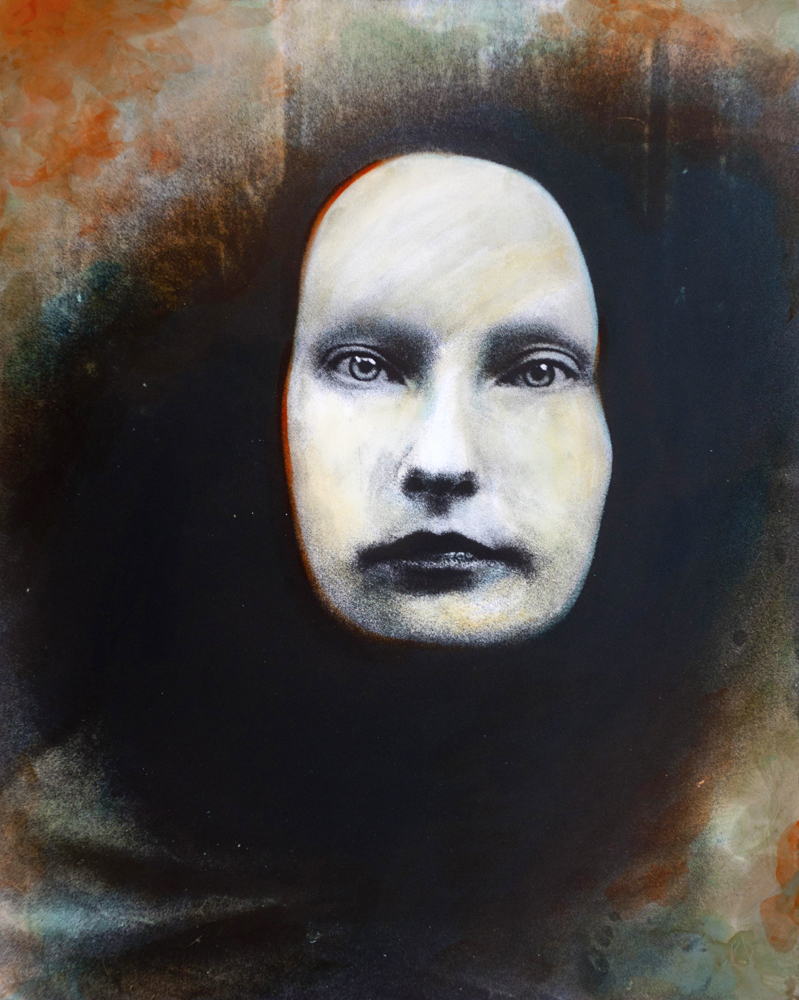
SaveThe last portrait is more direct. The eyes meet the viewer and the dark area around the face holds attention close to the center. Warm marks sit farther out, so the face stays readable. It is a useful contrast with the closed eyes, smaller figures, and ambiguous gestures earlier in the gallery.
When arranging a small series, test where a direct gaze belongs. It may feel like an introduction, an interruption, or an ending depending on the pictures around it. There is no universal sequence that works for every portfolio. Compare alternatives and describe the visual change each ordering makes.
Study the work without inventing the process
Choose two images and compare subject size, bright areas, dark areas, surface activity, and the strongest direction. Write down observations before interpretations. “The hand is brighter than the background” is different from “the artist wants us to feel a particular emotion.” Both kinds of response can be interesting, but they should not be presented as the same kind of evidence.
For a personal project, start with a simple photographic idea and a clear agreement with anyone pictured. Keep the original image and document any changes you make to a reproduction. If you want to explore physical print treatments, learn from a qualified source with suitable materials and safety guidance rather than copying an unknown method from a finished image.
Keep scans, original captures, working versions, and exports clearly separated. Maintain an independent backup. The storage option below can support a working copy of a portfolio archive. It is not equipment attributed to Damian or claimed to have been used for these photographs.
For a more deliberate approach to composition, light, and editing, explore the Shut Your Aperture Academy. Studying a portfolio gives you ideas. Practice helps you choose which ideas serve your own image, instead of borrowing a surface style without understanding its role.
Frequently asked questions
Who is Andrada Damian?
She is the artist featured in this August 2015 archive profile, also presented as Andrada Damianovskaia. Historical sources document photography combined with painterly techniques.
What does argentic photography mean here?
It refers to traditional silver-based photography. The original statement describes black-and-white photographs worked with pigments.
Was her entire practice free of digital technology?
That is not established. The 2015 statement described the featured works that way, while an older interview discussed scanning and sometimes making digital adjustments.
Does the gallery show how each image was made?
No. It does not supply reliable image-by-image materials, camera settings, lighting setups, or a complete production recipe.
Do the titles document events in the models’ lives?
No. They are artwork titles, not proof of an actual injury, ritual, mental state, or personal history. Interpretations should remain separate from factual claims.
Source note: Original August 2015 profile and twelve photographs; 2014 exhibition listing; 2014 ARADON exhibition report; 2016 UAP exhibition notice; older Ioana Filipas interview. Original artist portfolio link could not be verified during this update. Gallery images are Damian’s work, not photographs newly made by Edin.


